Everyone says it: Data is everywhere. Companies like Google, Spotify, Netflix, and Amazon collect our every search, listen, watch, and transaction. They often use our data to make educated guesses of what we want and personalize experiences for us. For example, Google uses your location to tailor suggestions when you search “best lunch spots,” so that you get the best lunch spots near you. Spotify uses your listening data to create Made for You playlists, that are designed to fit your listening habits, and a Release Radar, which suggests your followed artists’ new music and similar new singles.
Most companies also let you request or collect your own data at any time. In the privacy settings of your Spotify account, you can request to download your data. Here, Spotify starts collecting your data and sends you a link in under 30 days. In my experience, I received this data in under a week. Similarly, Netflix lets you download most profiles’ viewing data immediately; however, downloading the master profile’s data takes longer but, it also includes more data such as payments and previous profile names for all profiles.
Netflix Analysis
Data
I downloaded my family’s entire Netflix data and decided to do basic analysis on it. We have had this account since August 2010, so there was a lot to work with. To create fun, informative, and easy-to-understand visuals, I concentrated on everyone’s viewing history. Note, there are six members of my family, but only five profiles because Netflix limits an account’s profile count to five. So, two members share an account, leaving four truly unique profiles. As I built visualizations and split them by profiles, I realized that the master profile, “J”, contained data before profiles were introduced to Netflix, way back when everyone used the same account and we messed up each other’s algorithms.
Cleaning the Data
After loading our data into Tableau, I quickly realized it was messy. Messy data is data that has problems with the way it is structured, such as columns with multiple variables in them or rows with multiple observations in them. To tidy the data set, I used a python script and loaded the csv (comma-separated values) file as a pandas data frame. First, I dropped columns I wasn’t going to use such as “Bookmark” and “Attributes”. Then, I dropped any row that was a trailer, teaser trailer, recap, promotional, or hook so I could look solely at tv shows and movies that were watched. In the Title column, there was the Title of the show or movie, season/series, and name of the episode. For the purposes of our visualizations, we split on the delimitator and kept only the Title.
In Tableau, I added aliases for the Profile names to anonymize my family. I also grouped the Device Type twice. First into Phone, TV, Computer, Gaming Console, and iPad/Tablet. I aimed to put all the profiles on an even playing field and added a global filter to start the data in November of 2013, when Netflix introduced profiles. This allowed the master profile to not be skewed with more results.
Visualizations and Analysis
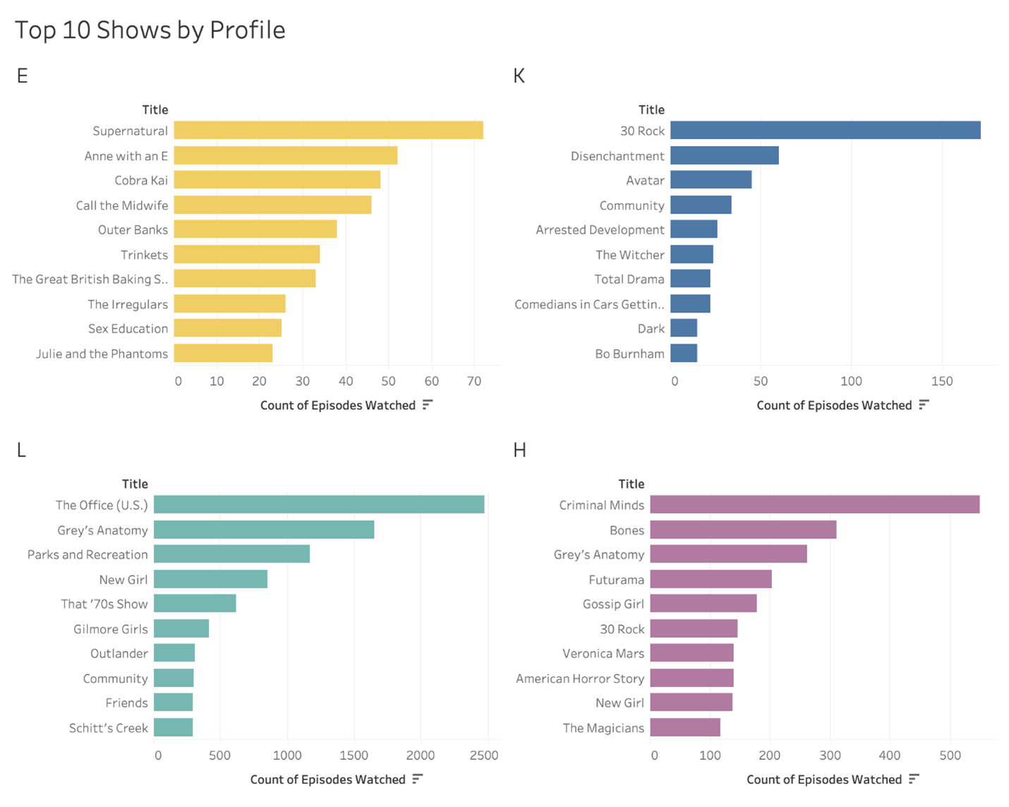
The first thing I wanted to look at was the Top 10 shows for the four unique profiles.

After creating the dashboard, I realized there was a trend in the genre for some of the profiles. E watched only Netflix original tv shows except for Supernatural. This along with the low count of watched episodes may imply Netflix may not be E’s main streaming platform. K has an array of genres including sitcoms, fantasy, animated shows, and comedy. We can note K mostly used Netflix to watch 30 Rock and might also use a different streaming platform more often, but e cannot make assumptions from the data because correlation does not imply causation. It may happen that E and K do not watch much television and instead enjoy reading, but we cannot tell from this data set. L watched mostly sitcoms: The Office (U.S.), Parks and Recreation, New Girl, That 70’s show, etc. and dramas: Grey’s Anatomy and Gilmore Girls. L also watched significantly more episodes than any other profile. H watched primarily procedural crime dramas such as Criminal Minds, Bones, and Veronica Mars. They also watched the dramas Grey’s Anatomy, Gossip Girl, and The Magicians. L and H seem to use Netflix the most or watch the most television.
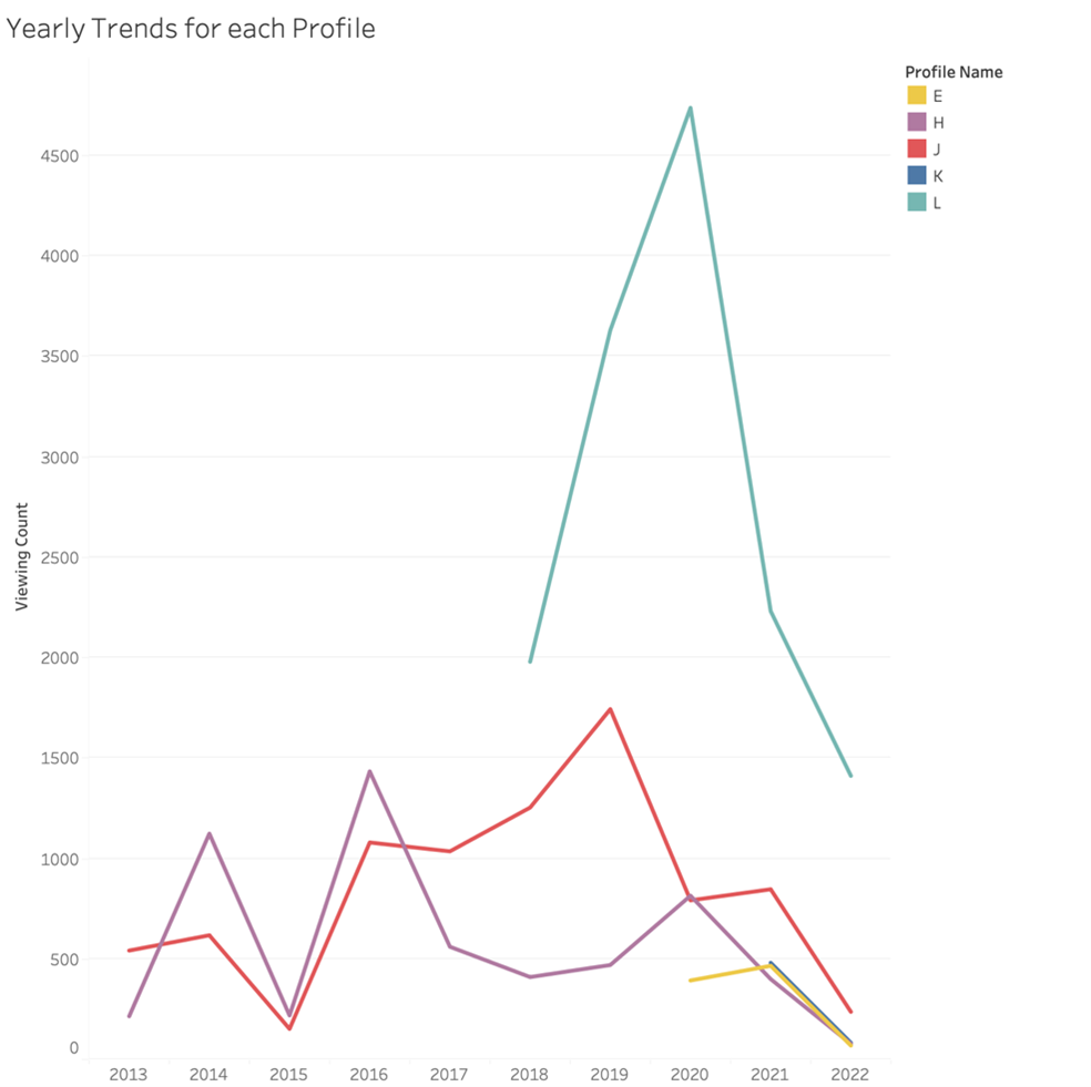
Next, I wanted to look at historically trending data. I created line graphs; one for yearly trends, and another for monthly trends. I included profile J to see more historic data.

Here, we can see that perhaps the reason E and K did not have high watch counts is due to the age of their profiles. E’s profile is only about two years old, while K is maybe a year old. We can also see that although H and J have the longest surviving accounts, L’s account has the highest volume. We can also see a significant increase in viewing in 2020 for both L and H, which the COVID-19 pandemic and lockdown may have contributed to. We also see a steep fall in 2015 for H and J, which was about the time Prime Video started the Streaming Partners Program (now known as Amazon Channels), which may have been a cause for this drop.
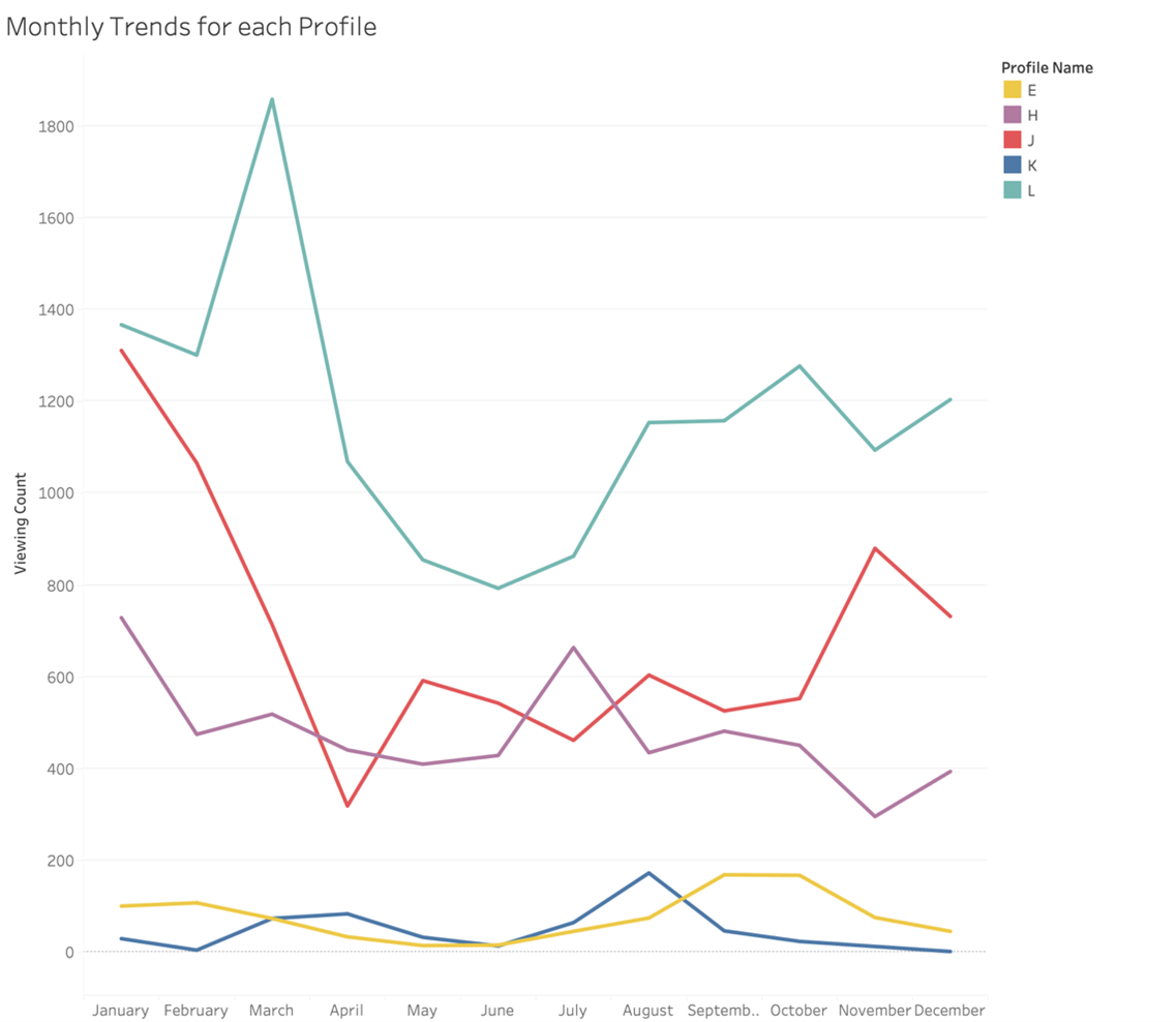
Yearly trends are fun, but I wanted to see more. Specifically, what months we tended to watch television the most; so, I looked at monthly trends.

Here, we see E and K have relatively steady viewing trends. K has a slight increase in August, right around the end of summer or beginning of school when they had lots of free time, but this number drops off through the semester. E has a high plateau from September to October during the first semester of school when they were likely avoiding their schoolwork. Notice both accounts have a drop in May/June when they needed to turn in all of the work they had most likely been avoiding. L follows the same trend more extremely; however, there is a large jump in March that we may want to contribute to the beginning of lockdown in 2020. J has a peak in January and a low in April, with no apparent reasoning behind it. H has similar highs in January and July, possibly due to school breaks, along with comparative lows in May and November.
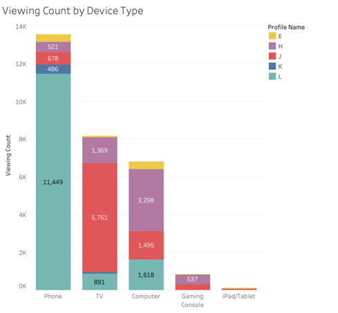
Finally, since Netflix included the type of device each TV show or movie was viewed on, I wanted to see a breakdown of what devices we were watching television on.

I also broke the Device type down by Profile to see who exactly was watching what, and where. We can see that L watched almost exclusively Netflix on their phone, but sometimes on a TV or computer. K also primarily used a phone. In contrast, J watched on a TV the most, while H used a computer and E split their time between phone and computer.
Data can be fun. It does not always have to be financial data or data of employee records, although those can be fun too if you are a data professional and know what to look for. Using our own data from our daily lives can give us insight into our habits. For example, Spotify releases Spotify Wrapped. It uses individuals’ Spotify listening data to give listeners insights such as top genres or most listened to artists at the end of the year, which gets people excited. Spotify Wrapped gets posted all over social media and everyone gets to see what each other’s year of music looked like. The same thing can occur for any data anywhere, from individuals doing it themselves, to large companies releasing it for their users.

